


Today – more than ever before – people are regularly exposed to websites. On average an American visits 89 websites and 2,646 webpages per month. This exposure rate means today’s consumer has a more discerning eye than ever before.
A viewer will make instant judgements about the quality, professionalism, and credibility of your business based on your web design. As exposure to websites increases, web designers must stay relevant and make sure they stand out in the noise.
Standing Out Doesn’t Mean Using Trendy Tactics
Sometimes people mistake standing out for trendy fonts, flashy colors, and information packed layouts. People have become desensitized to unsophisticated marketing-like techniques and noisy design.
Users often associate poor web design with unqualified, amateur, or even desperate businesses. And don’t think that you need to use all the space on a webpage – you risk overwhelming your viewer and losing credibility.

This is an example of website design that is trendy and noisy, with a look that may not stand up to the test of time. It will be out of style in a couple of years and is very difficult for the user to navigate. Great websites make a clear call to action, which can get lost in a busy design.
Simplicity is Elegant
Some of the most beautiful websites today are simple in both color and design. Simplicity lends itself to timelessness, which will prevent your audience from realizing exactly when it was created. You never want someone to look at your website and know the year it was made because you blindly followed a trend.
Originality Through Simplicity
Too many web designers are quick to think the best and easiest way to be original is to fight common design principles. Your design can be original and still beautiful. Images can make a big impact on how you represent yourself and your brand. Try using a few eye-catching photographs that are completely unique to your business.

This website is clean, compelling and uses photos in an original way.
Functionality is Critical in Web Design
Website design is unique in that it also needs to be user-friendly. It’s important to build functionality into your design so it becomes a cohesive element, not an afterthought. Things to consider are:
- Clear and eloquent purpose
- Easy-to-read fonts
- How much information is visible on each page
- Using menu expansion effectively
- Smooth and seamless transitions
- Your use of negative space
- Obvious calls to action
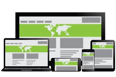
This website is a good example of design that looks great on a desktop, tablet, and phone.
Consider How Your Design Will Look On Different Devices
Be sure to consider the various platforms where your website will be viewed. Screens vary in dimensions. Simplicity will lend itself to a smooth transition across devices.
Quality Graphic Software – It’s Never Been Easier
Stay organized and outline both the practical and visually appealing elements of your website before you begin creating to save yourself trouble down the road.
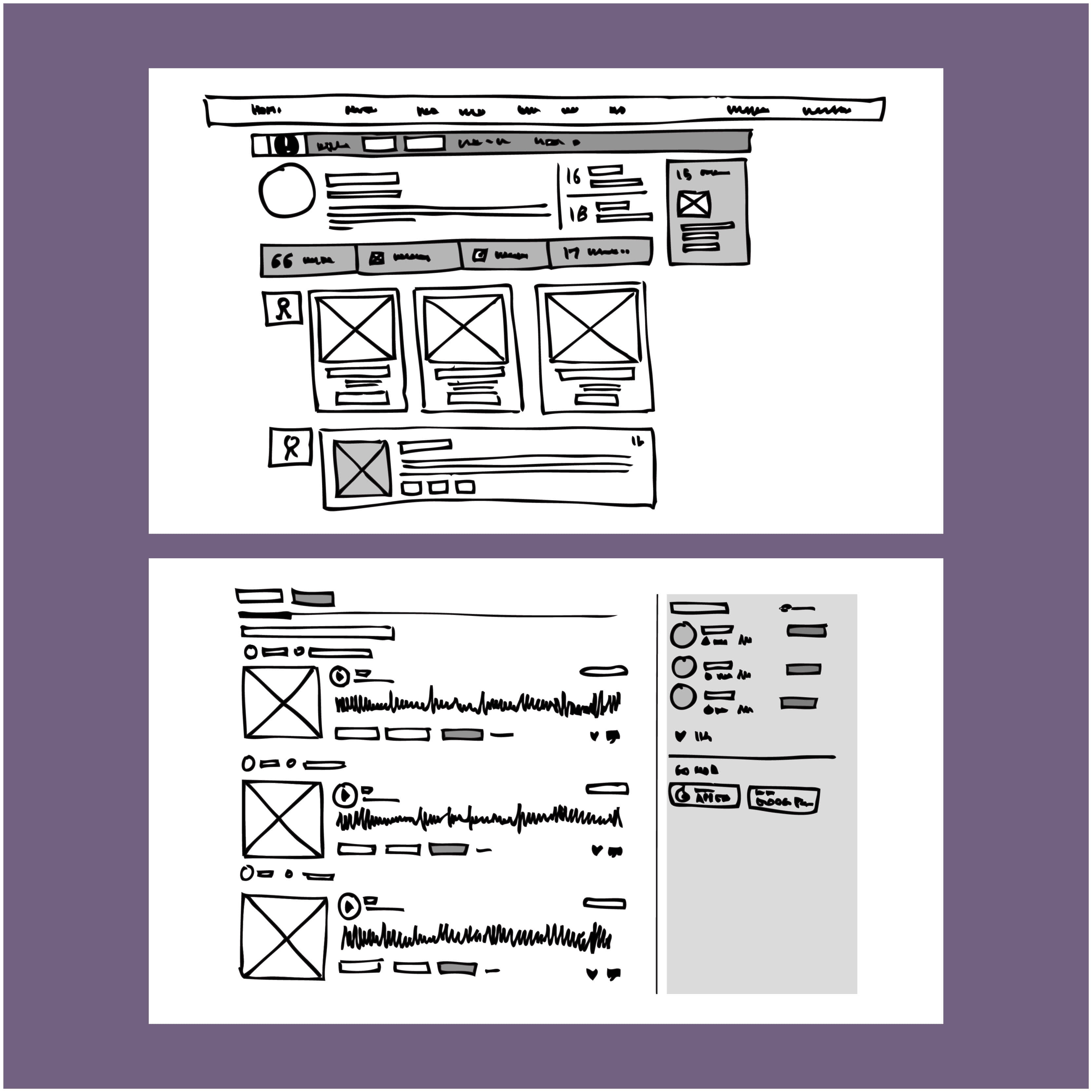
Create your website wireframe and design mock-up side by side to keep both functionality and beauty in focus.
Today, graphic design software like CorelDRAW has built-in web design capabilities that allow anyone to create beautiful one-of-a-kind websites that will be used and appreciated by users. As you envision your site, keep the principles of design in mind and your viewers will enjoy your work for years to come.
Sobia Hameed is a pragmatic Marketing Certified Product Manager of 6 years, with experience in managing consumer and business to business products.

test comment