
As I mentioned in Friday’s blog post, a logo can have a huge impact on how successful a business, organization, or person can be. A good logo reflects what you do, and how customers should think of you. A great logo does that, and has the ability to be easily recognized – even when changed!
I looked through thousands of logos and picked the 25 that I feel best represent those qualities. In no way have any of these companies endorsed, suggested to, or even contacted me. I’ve simply chosen logos that are, in my opinion, doing a great job at what they’re designed to do. Without further blathering, here’s the list of the 25 great logos and why they made it here today.
Nike
We’re starting this list with a logo that is, arguably, one of the simplest and yet most elegant. It really says everything that is has to about Nike as a company. It’s quick, simple, balanced, and full of movement. And it’s so easily recognized that Nike doesn’t even need to add their name!
McDonald’s
Speaking of simple and recognized the world around, McDonald’s certainly falls into this category. Over decades, the fast-food chain has changed a lot about themselves, but one thing that’s always remained is the ‘golden arches’ is they’re referred. Plus, let’s face it, the M looks like a bunch of french fries, and that’s pretty awesome.
Again, a very simple design. In my opinion, Twitter has the most well-designed logo out of all the social media sites that I’m aware of (which you can imagine is a lot, since I’m a social media manager) Even the name Twitter sort of implies something important; users have only so many characters to say what they want to say, so make it short and sweet!
Batman
That’s right. Batman. The Caped Crusader has always been a bit of a mystery to the people of Gotham City, but his logo sure hasn’t! Now, the colors may not perfectly reflect his character (dark and brooding), but the design of the bat-symbol sure makes up for it.
Apple
It is what it is. Literally. Their logo is a simple apple with an interesting glowing effect, but it works! People all around the world recognize this little apple as the not-so-little Apple company logo. What’s more, it’s so simple that it can be easily associated with real-life things and thought of because of it.
Intel
As a company in the computer business, it’s important that design be simple, while also conveying a high-quality feel. What’s more, they need to weigh all of that against the balance between fun and professional. Intel got it right with a very simple techie font, and the oval surrounding the company name really adds interest to an otherwise stoic design.
Target
Not only is Target’s logo simple and literal, it’s only one color. Yet, the marketing team at Target really took that fact to the limits of it’s usability by making the color red theirs. They use red (and usually white) everywhere: TV commercials, internet ads, even the design of their website. Color is an important part of logo design and branding, and they really nailed it here.
World Wildlife Foundation
What’s cuter than a panda? Answer: nothing. And that’s just one of the reasons that this logo does so much to be successful. It’s really easy to apply or add to any type of media, it makes a strong imprint on the biggest mission of the organization (that being the protection of endangered species), and it tugs at the heartstrings. And again, it’s just so adorable!
National Broadcasting Company
This is one of the less simple logos mentioned so far, but it sure does a great job at being successful and memorable. When you see that rainbow on your TV, you immediately know it’s NBC. Though the fact that the logo is actually a peacock gets lost on most people (I didn’t notice until a few years ago), it doesn’t matter. Because the peacock isn’t important – it’s that swanky rainbow of feathers!
Hewlett-Packard
Or as it’s much more commonly known, ‘HP’. There’s one thing specifically that I think this logo does that’s great, and that’s the indent on the letters ‘hp‘. The design of this logo is almost the same upside-down as it is right-side up – and that’s funky! That one quality makes this logo one that you need to look at a few times to really get.
Volkswagen
Good ol’ Volkswagen. They’ve certainly reinvented themselves a lot of times over the years. But reinvention as actually a good thing for companies. It shows consumers that they evolve and change just like we all do. Change can be very humanizing, and Volkswagen has done it well. Nowadays, they seem to be going for a more high-end look, which I feel this logo really shows.
General Electric
There’s one thing that really sets GE apart from lots of other companies; they’re keeping it classy! What I mean is, GE’s logo reflects the idea that they’ve been around for a while, and that they’re trusted when it comes to appliances and other technologies. Which is important. Plus, the rounded font and logo really sets the tone for security and safety.
Star Wars
The 70’s was a time of blocky letters and flashy media. Although the Star Wars series has moved past the era of disco, the old font has stayed true to the space-themed genre we’ve come to know and love. It’s modernistic enough to hold up to current trends, and has become iconic.
Lego
Playful, colorful, and formatted into a rectangle. The great thing is that this both applies to the logo as well as the actual product itself! And that’s brilliant design work, because when you’re selling to kids, you need a simple, colorful design that’s gonna remind them that they want to play.
Disney
This logo in particular uses the castle motif, but even without it – Disney’s logo is really memorable and whimsical. The fact that it’s the signature of the creative genius himself just adds to the magical quality that this logo holds. And that’s exactly what Disney’s logo should be. It’s rounded and playful, and the castle reminds us of some of the more iconic Disney films.
Best Buy
This design is clever in a way that’s pretty subtle. If you notice, the logo is made to look like a sales tag that you’d find… well, on one of the store’s sales. Which is meant to be the point of best buy: that everything you’ll find there will be a ‘best buy’ or good sale. It’s very simple and often times goes unnoticed, but the idea is there in the unconscious image of the logo – and that’s enough.
Federal Express
Not only did they kind of ditch the boring name for the more interesting ‘FedEx’, they’ve done something very subtle here. But once you’ve seen it, you can never un-see it. Because of how close to each other the ‘E’ and ‘x’ are, the negative space between them is an arrow pointing rightward! Not only is that a really cool little trick they pulled off there, it says a lot about the company and their forward motion.
Burger King
That’s right, 2 fast-food chains are being represented here! If that isn’t proof that we’re not biased, then I don’t know what is. But back to logos. I really like the design of Burger King’s logo for a few reasons. The font is playful and fun, primary colors work really well with each other, and it’s a burger. What more can you ask for?
New England Patriots
Whether or not you like the Patriots, you have to admit that their logo is very well designed. It’s simple, uses color well, and the face is shaped like that of the American flag. And seeing as they’re ‘the Patriots’, having a very America-themed logo just seems to make sense. The face of their logo has a bold and strong profile, which speaks to the character of football players in general.
Electronic Arts
Like HP, GE, and a few others on this list; Electronic Arts has gone the way of acronyms and stuck to simply being ‘EA’. This logo in particular is great because it’s very active and full of movement, while still holding a technological-looking font. It’s rigid but thin, which adds the strength required of athletes with the fun of games.
Nickelodeon
This sure brings me back a decade or two. Why do so many kids love Nickelodeon? A lot of it has to do with their programming of course, but I’d argue that the logo plays a certain role in ‘all that’. It’s become a running theme used all over the network, and continues to be used to this day. The really amazing thing? This orange blob has gone through so many transformations and changes but still remains easily recognized. There are very few companies that can pull something like that off successfully. Which brings us to…
A company that has almost become synonymous with logo-change, Google has been known to do some pretty radical things to a logo that is otherwise boring (in my opinion at least). The logo itself is pretty unimpressive – what’s amazing is how many different iterations have been generated over the years. I remember going to the Google homepage nearly every day just to see what crazy thing they’d done. And that’s something that I think sticks with a lot of people when thinking of the search behemoth.
Starbucks
Starbucks’ logo confuses me even to this day. I know that the woman is intended to represent ‘mother earth’ or something to that extent, but it just seems a little too esoteric for a coffee company. But, that’s something that Starbucks thrives on with the demographic they have. The one truly great thing about this logo is actually something they took out. The logo used to have the words ‘Starbucks Coffee’ printed around the logo, but due to international release of their company, they took the words off since English is not the primary language of most countries. And it did them well.
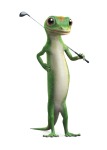
Geico
Mascots and logos are two different things, but there comes a point in a mascot’s popularity where they become much better known than the company’s logo. In this regard, I give you the Geico gecko. Now, because he’s a mascot, his personality comes into play here in a big way. And luckily for Geico, they really nailed it when it comes to making a character that entertains the masses.
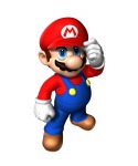
Mario
Last, but certainly not least comes Nintendo’s faithful IP (intellectual property) Mario. He’s become arguably the biggest icon in the way of video games, so as a gamer myself, it would seem odd not to mention him. Unlike the Geico gecko, it’s actually Mario’s lack of specific personality that makes him so very lovable. That’s not to say that he’s boring. What I mean is that Mario rarely speaks, and as such, is very easy to relate to. People can sort of implant their own personality on Mario. And that works!
So, that’s it! I hope you’ve enjoyed my synopsis of the 25 brands who’ve really aced their logo designs. What are some of your favorite logos?

2 thoughts on “The 25 Brands That Nailed Logo Design”